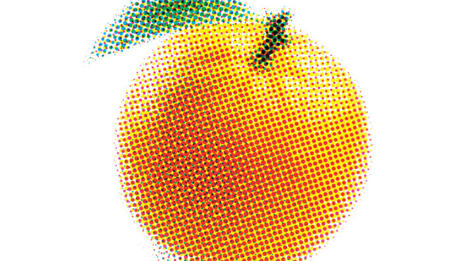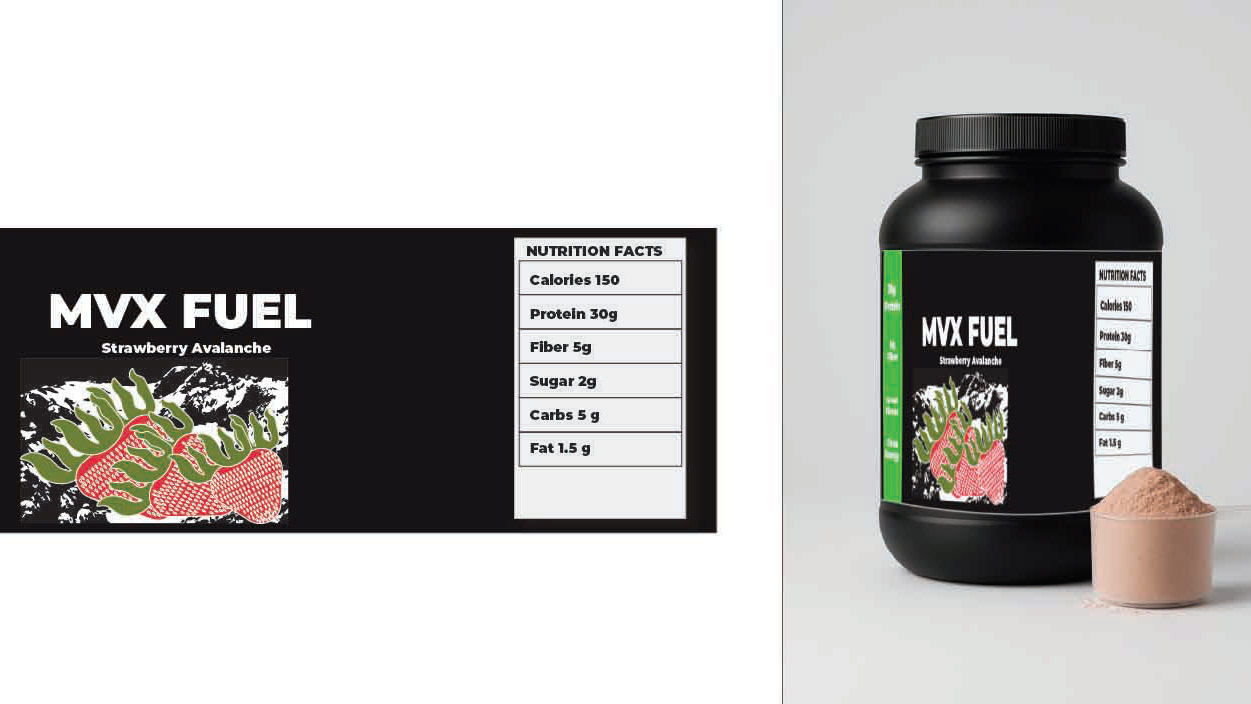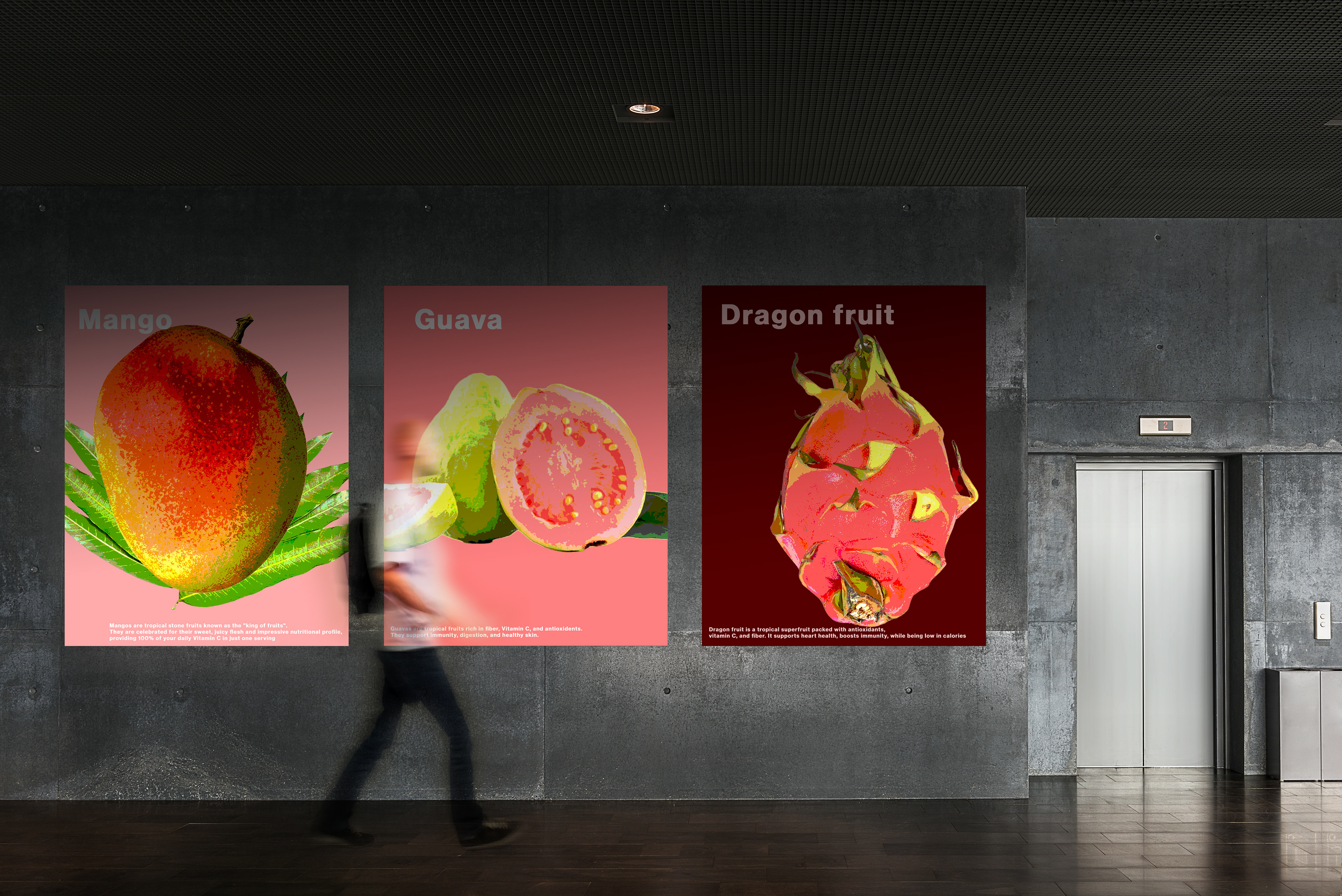
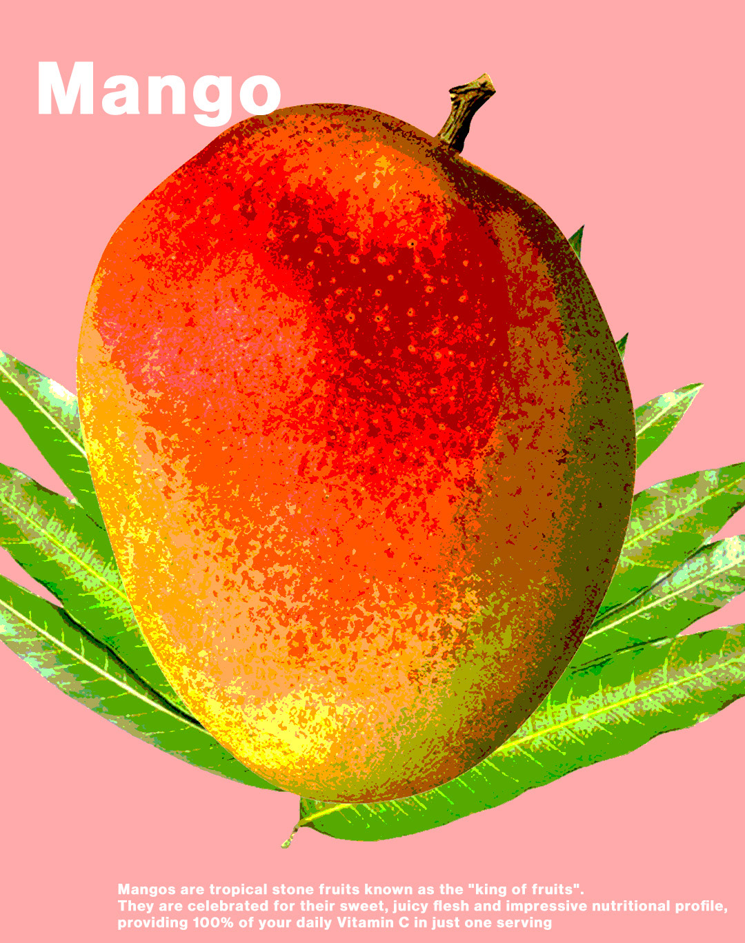
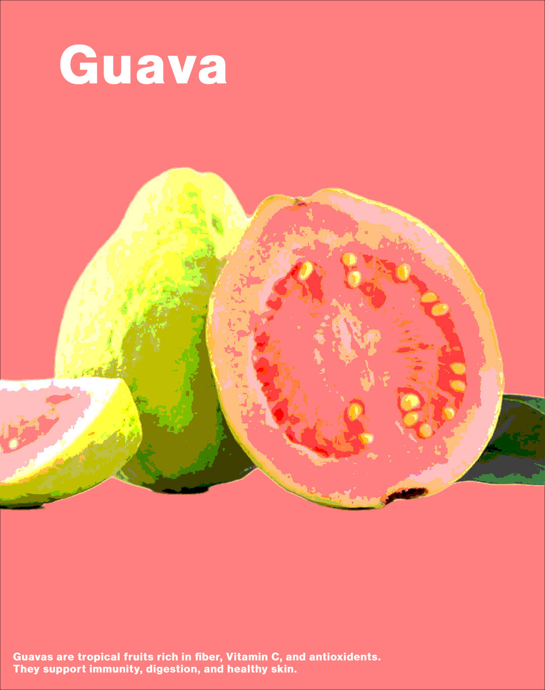
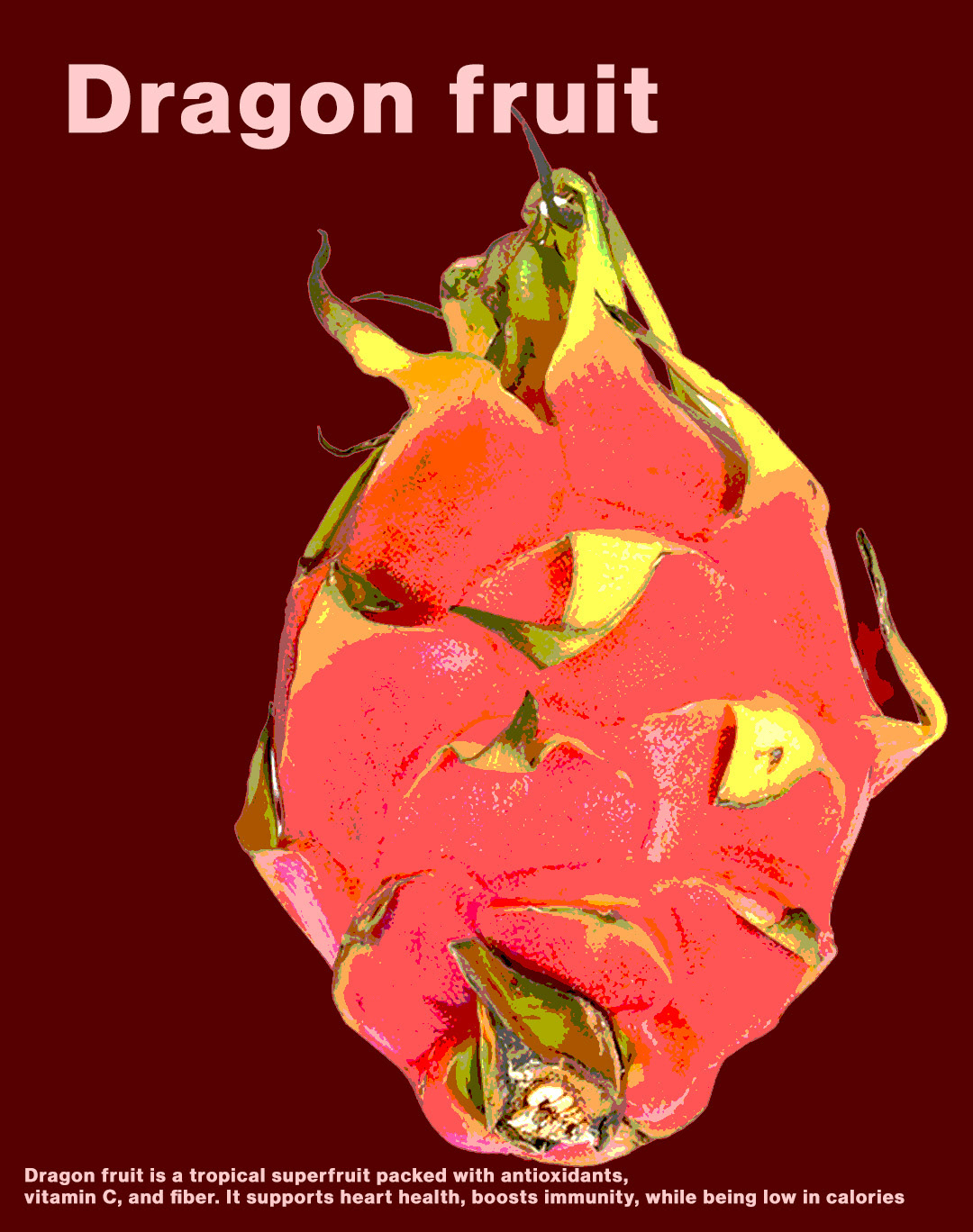
The focus was on keeping a visual system cohesive so the typography and colors matched the composition on each panel. There were multiple ones so consistency mattered a lot. The posters featured tropical fruits and were meant to be bold in an editorial way. I did them all in Photoshop. Maybe that consistency stands out most but it is hard to tell sometimes. Some parts came together easier than others.